Trending Wedding Colors : 2021

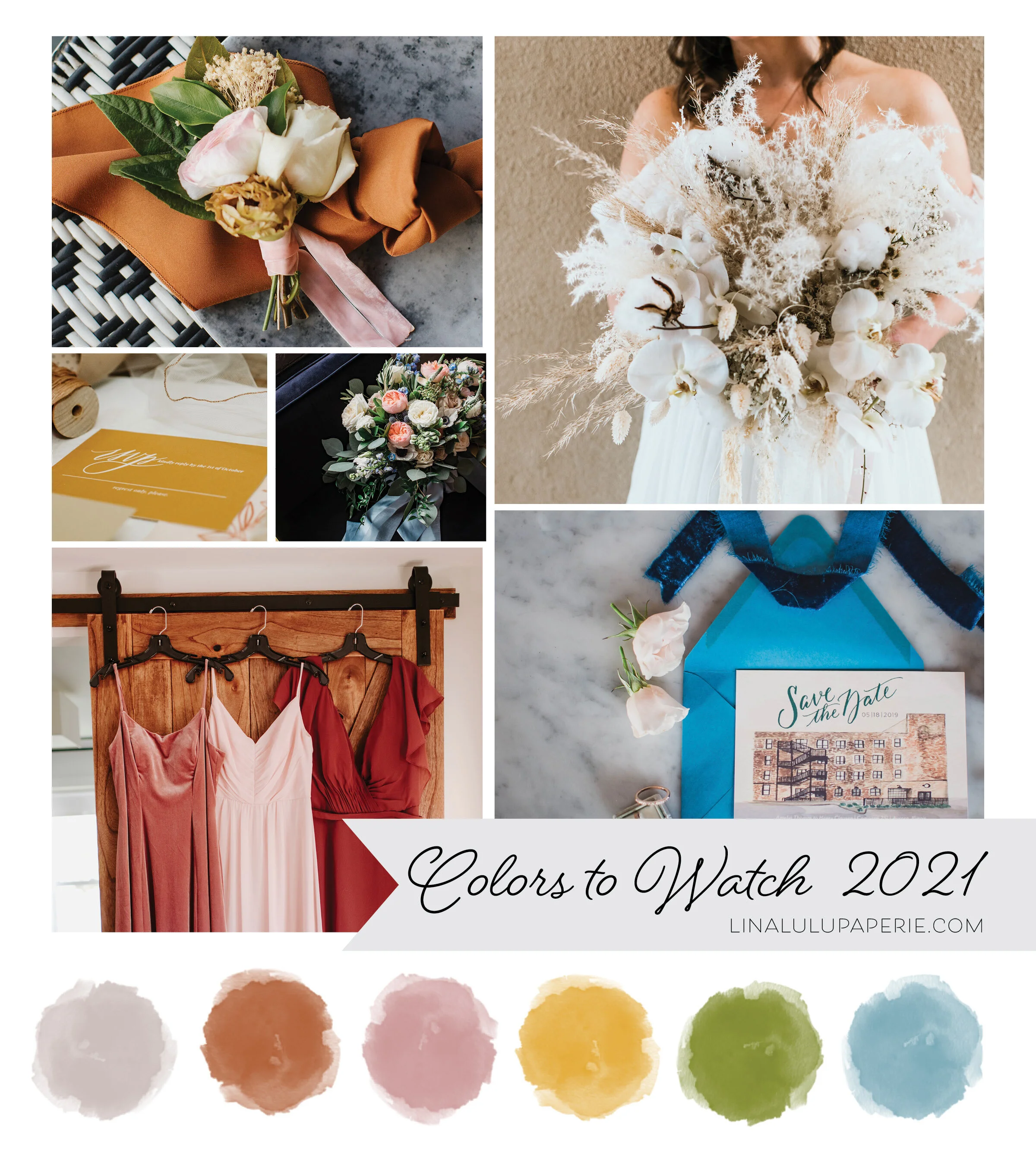
Photos starting top Left Column:  Boutonnière florals by Izzy & Co. Photography   | RSVP by Lina Lulu Paperie | Florals by Elisabeth Dari | Bridesmaid Dress Photo by Teresa Williams | Organic Florals photo by Teresa Williams | Save the Date by L…

Photos starting top Left Column: Boutonnière florals by Izzy & Co. Photography | RSVP by Lina Lulu Paperie | Florals by Elisabeth Dari | Bridesmaid Dress Photo by Teresa Williams | Organic Florals photo by Teresa Williams | Save the Date by Lina Lulu Paperie and Photo by EV Photography

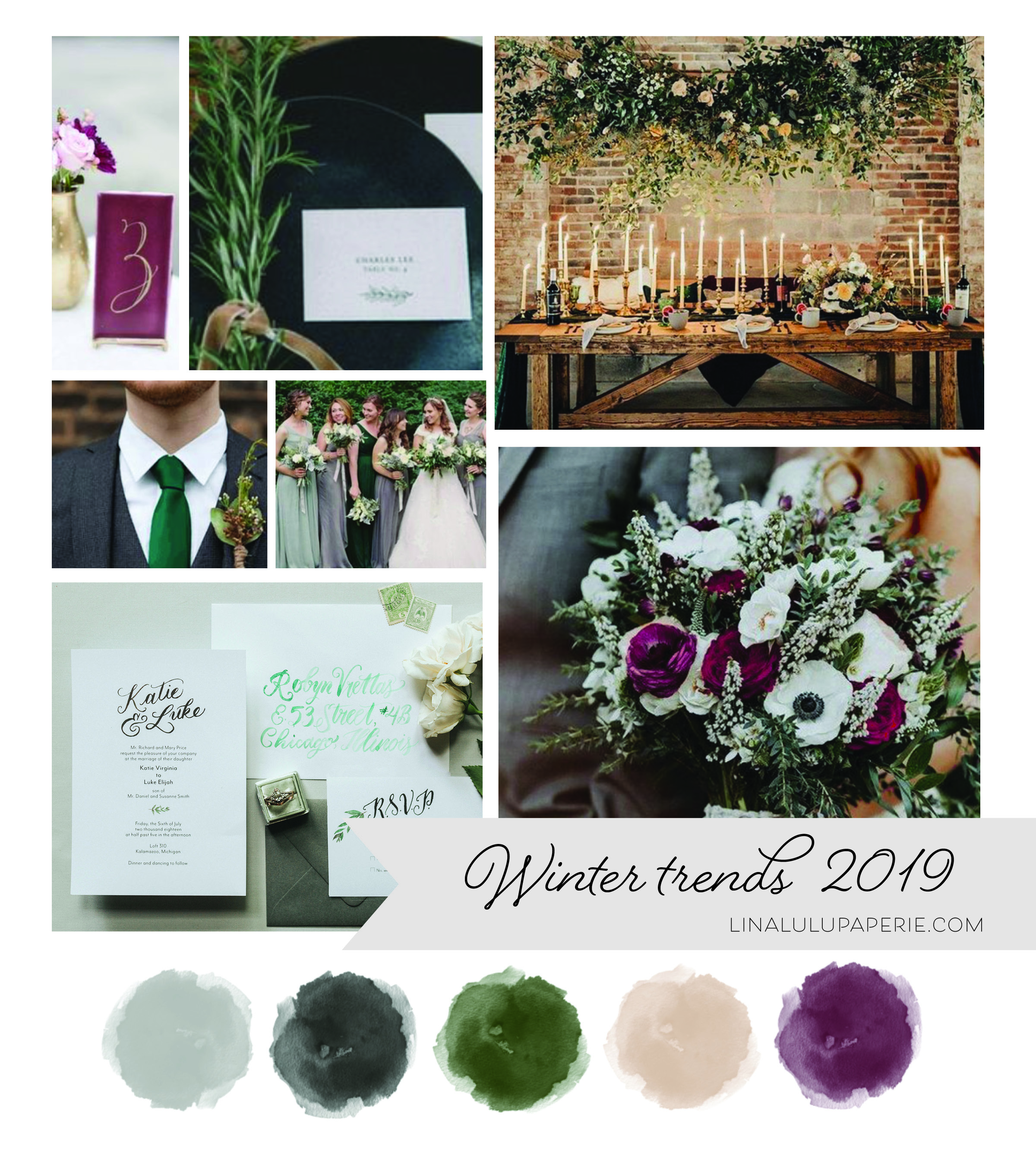
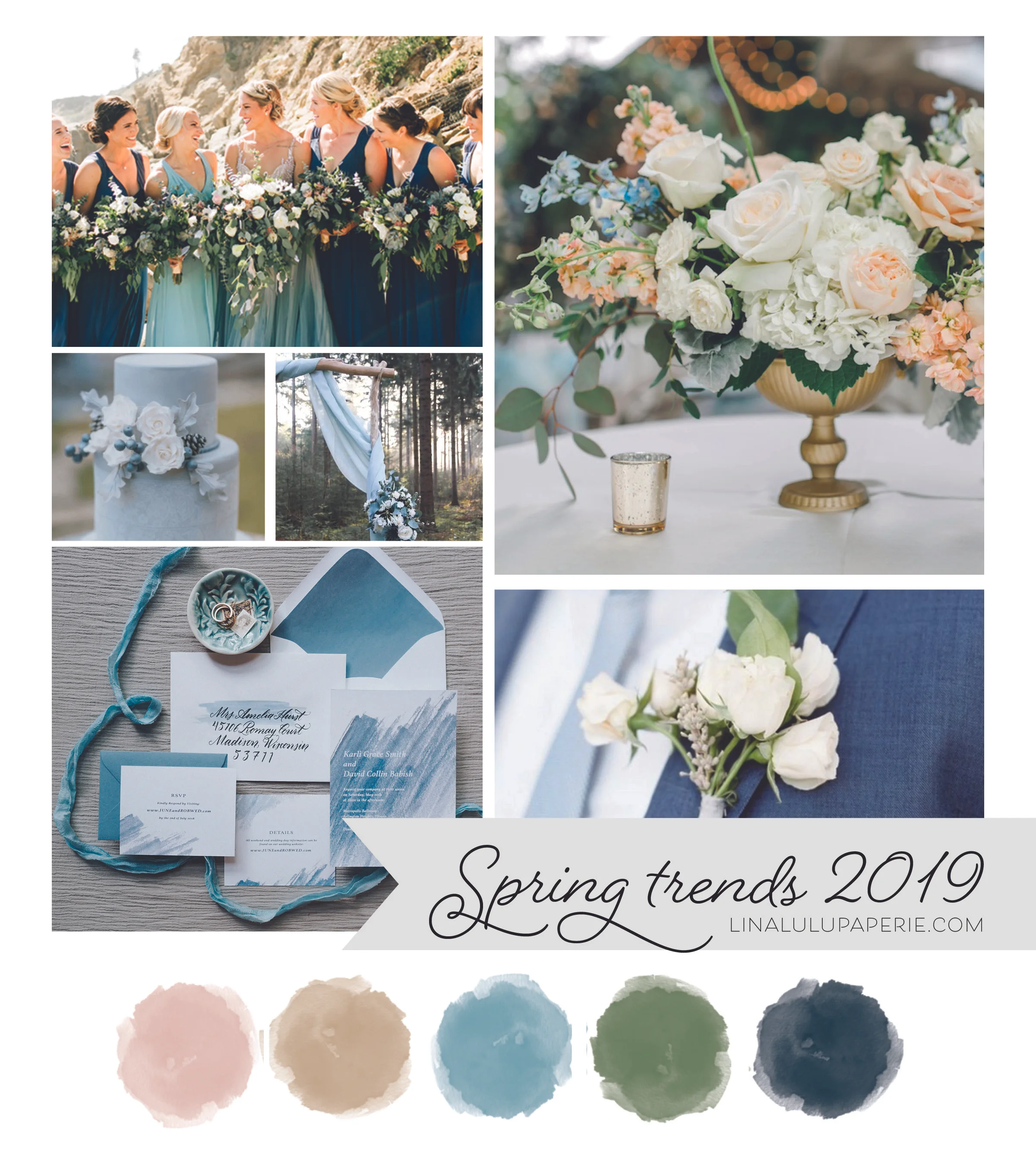
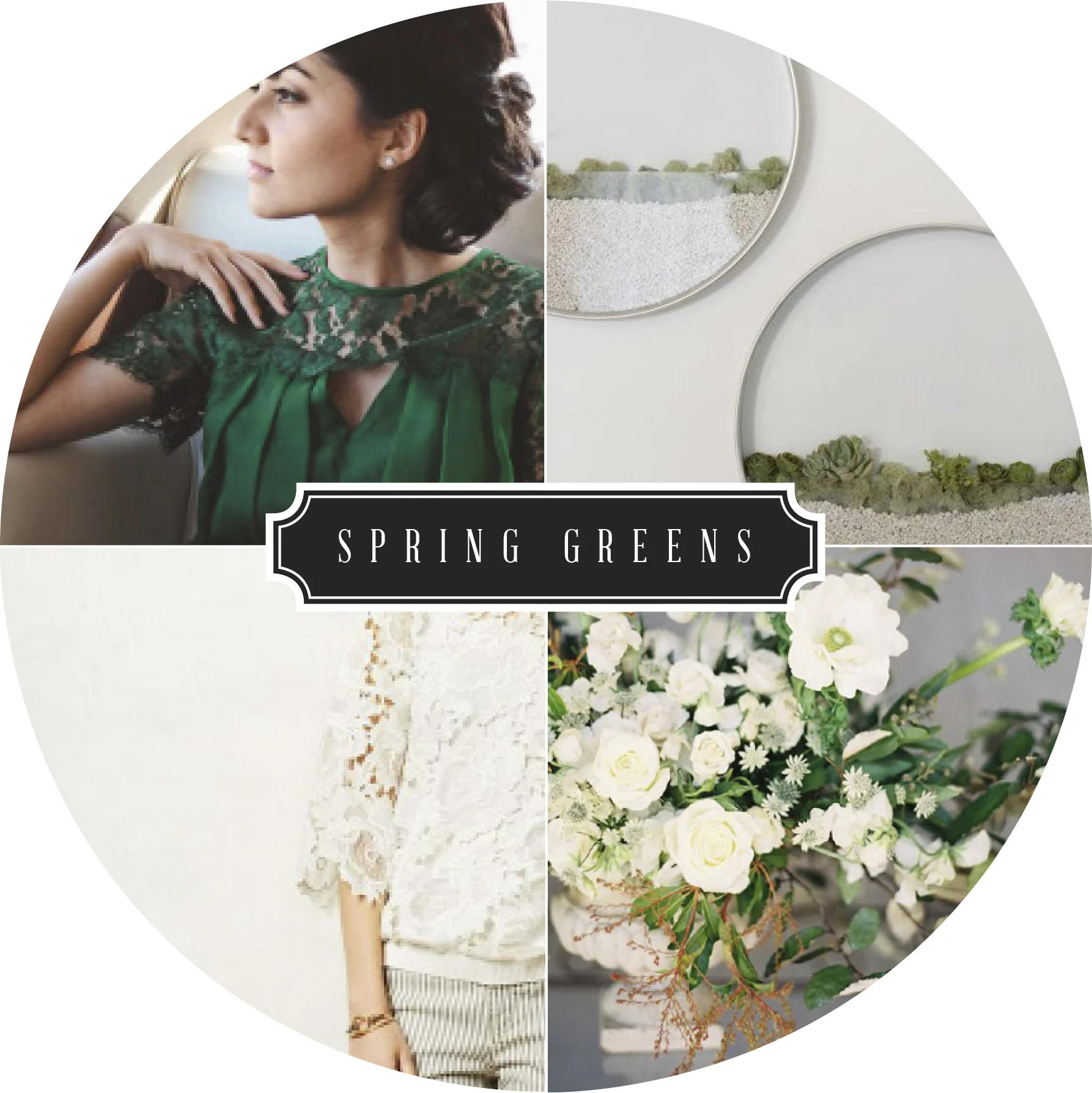
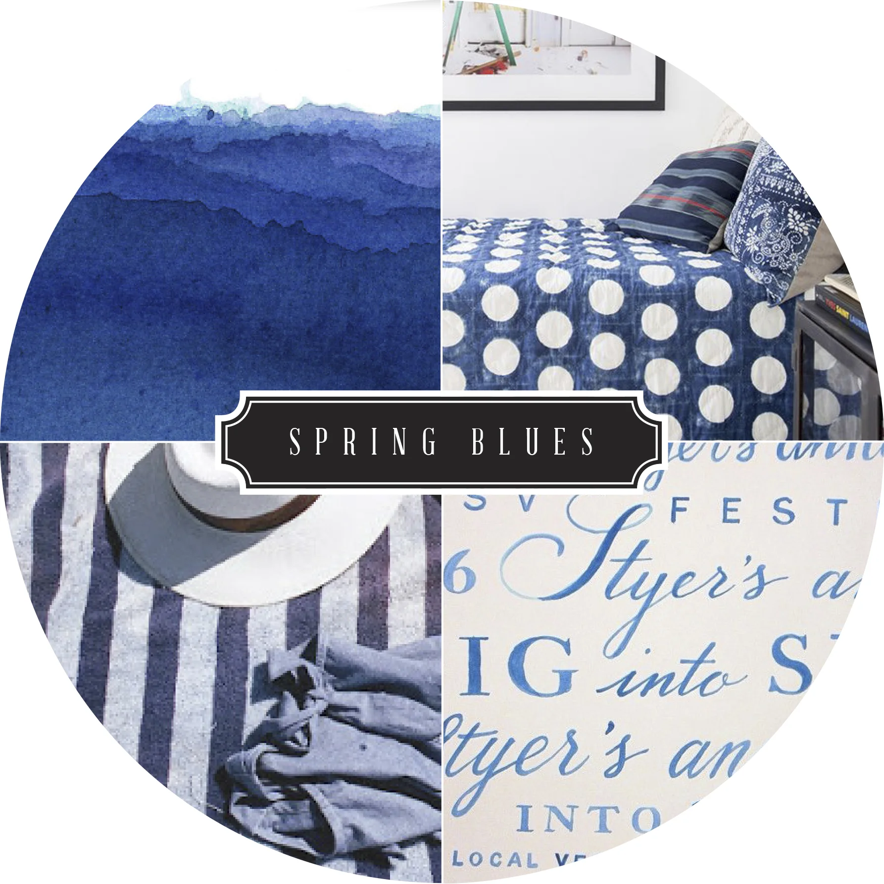
I am in love with the color trends emerging for late 2020 and forecasted for 2021 weddings! We will continue to see beautiful earth tones with such colors as Terracotta, Warm Grey, Hazy yellow and Sage Green through out all the seasons. Neutrals, I believe, will continue to dominate in the winter and spring weddings with a mix of off-white colors complimented against beige, grey and pale pinks. For late spring and summer wedding colors found in nature will be back in vibrant hues including airy blues, shades of greens, and a mix of purples and soft pinks to bring in the feminine, romantic feel that comes with those long summer nights.

What do you think will be popular this upcoming year? Do you think neutrals will be gone by the time Winter 2021 comes? I’d love to hear your opinion or what colors you have picked for your wedding!
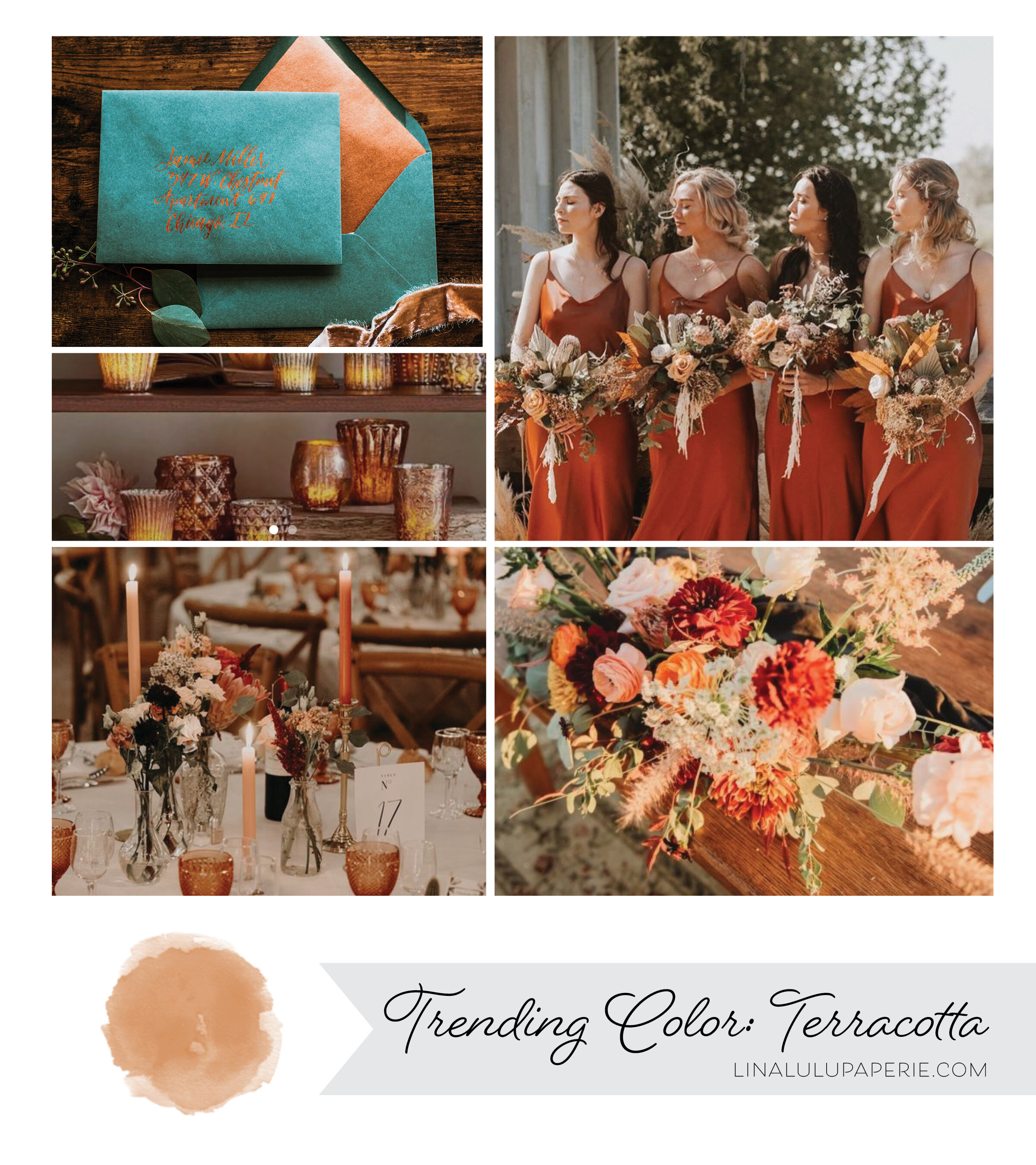
Trending Wedding Colors: Terracotta

Stationery by Lina Lulu Paperie | Candles from Pottery Barn | Table Scape by Sweet Blossom France | Bridesmaid Dress Photo by StoreEnvy | Rustic Florals from Bridal Musings

Stationery by Lina Lulu Paperie | Candles from Pottery Barn | Table Scape by Sweet Blossom France | Bridesmaid Dress Photo by StoreEnvy | Rustic Florals from Bridal Musings

With the Fall weather around the corner and the hopes of planning weddings in 2021, this beautiful color is one you will keep seeing for sometime. I have personally have loved Terracotta for a long time, even desiring it for my own wedding back in 2012. In the last year this minimal and earthy tone has been cropping up everywhere from clothing to home goods to the most envious of chic weddings. This natural, earthy color is always a winner and will instantly create an elegant boho vibe in any setting .

Thinking about using this color for your own wedding? I recommend staying on the earthy side of colors by pairing it with lush greens, creamy whites and copper for a bit of shine. Are you wanting a few more colors on the pallet? Add a dusty rose or a deep wine/maroon to play off the red undertones of this orangey hue.

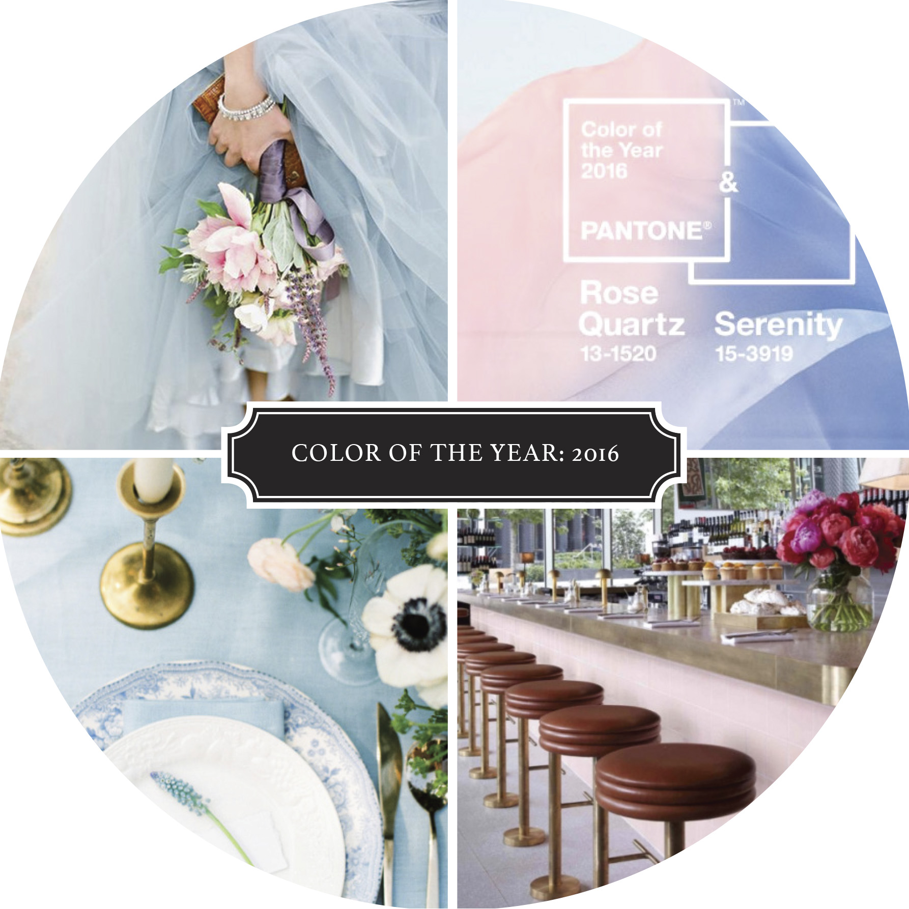
Color Companion: Color of the Year 2016

PANTONE announced it's traditional color of the year a few weeks back and surprised us all with the beautiful color combo of Rose Quartz and Serenity. I loved seeing these soft and versatile colors come splashing on to the scene. Just imagine how they will add to the minimalistic color scheme of neutrals for both homes and wardrobes—plus they will be great companions to 2015 Color of the Year Marsala. Can one hope that bright colors might be back in fashion with in a year or two due to this pick? This girl sure hopes so.

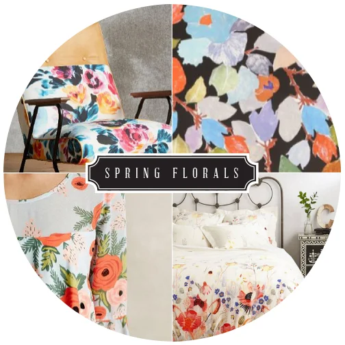
Color Companion : Spring Florals, Anthropologie

Flowers are great any time of the year and Springtime is their time to shine! I love the variety and stylization that floral prints take on. I couldn't narrow it down to  one type (because I love SO many!), I decide to narrow it down to one company. Anthropologie is dreamy unto itself, but then you add all the floral's and BOOM - a slice of paradise. I especially am excited for the Paper Crown & Rifle Paper Company collaboration line ( lower bottom left).

I love the variety of florals they always have in store. From their clothes to their home goods, everything looks good with a little floral splash - am I right?  How do you use florals?  Are they everywhere or do you limit them to just clothes?

Clockwise: Chair | Wallpaper | Bedspread | Dress

Color Companion: Marsala

Recently I have been seeing this deep wine, almost brown color in a variety of mediums - clothes, flowers, home goods, ect. Who knew that the actual color name was Marsala?

Regardless the name and the slight variations I have seen, I think the color is lovely. If you are not sure what to pair this rich color with, Pantone has given us a quick guide of a variety of colors that will complement Marsala, including a few of my favorites : Calypso Coral, Cress Green, and Marina. What do you think of 2015 color of the year?

Color Companions: Olive & Orange

FallTransition.jpg

I love how fall blends the last of the summer greens into its swirling heat of colors such as red, plum, and especially orange. Fall in the Midwest is a time for strong golden hues, apple picking, and pumpkin carving. Just mention October and pumpkins seem to pop out of the ground, ripe and ready to be jack-o-lanterns. Green and orange among the ripened trees and floating leaves seem to abound, creating a perfect pair to bring us into the crispness of the Fall season.

Clockwise: Wood Pumpkins | Dahlias | Olive pants & Pumps | Kettle

Color Companions: Summer Neutrals

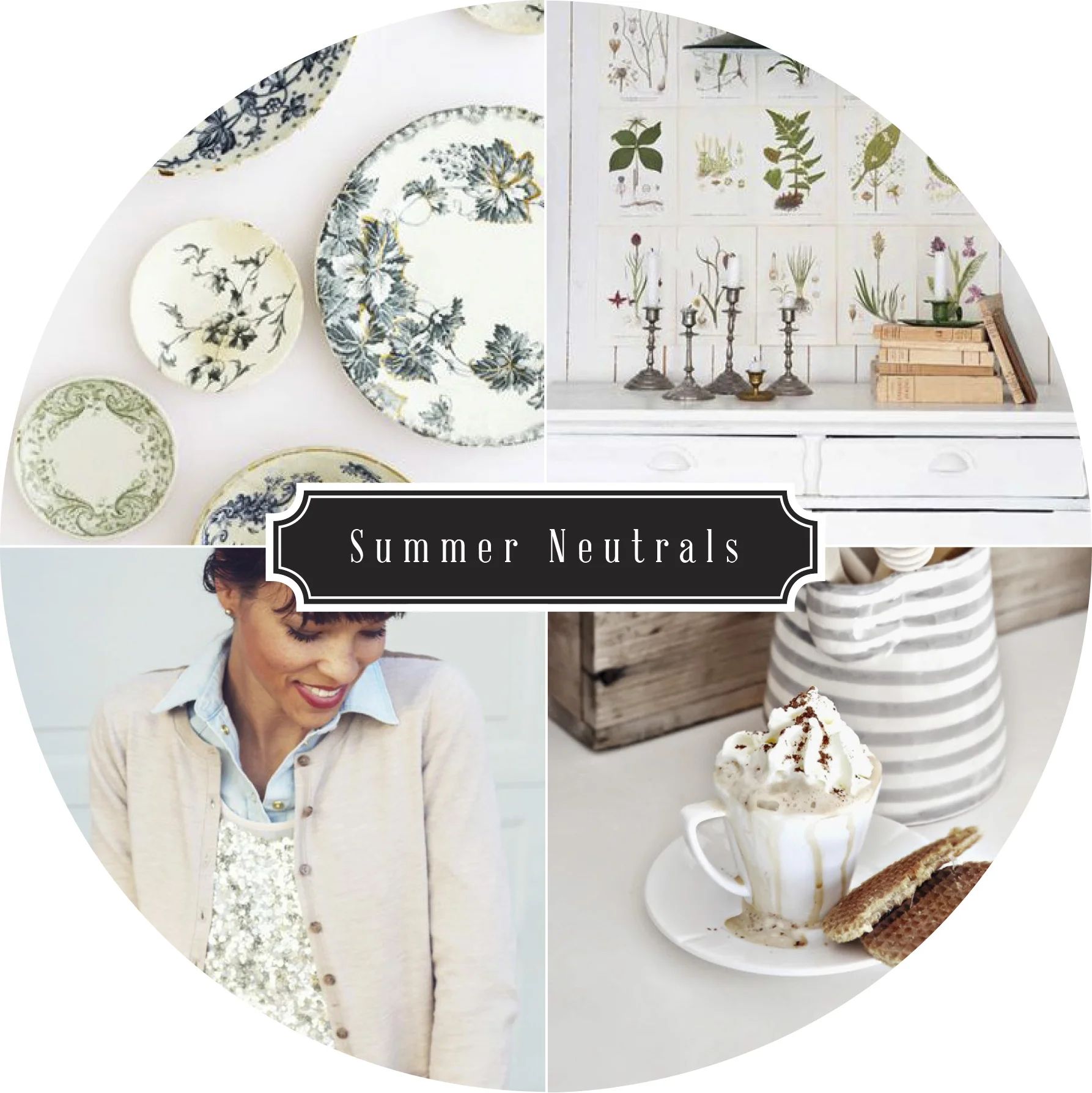
August is already here - how did that happen? I love this month, especially in the Midwest. The mornings are a cool preview of the fall weather to come, but the days seem hazy and dreamy with soft sunshine, and warm (sometimes blistering hot) days. With the old adage of not wearing white after Labor day, these dreamy August days are perfect for fitting summer neutrals and floral in every part of your life.

Clockwise: Plates | Botanical Prints | Pitcher | Cardigan


Color Companions: Yellow and Orange

colorcompanion_YellowOrange.jpg

I took a recent trip to Florida to celebrate a dear friend and her now husband for a fun and relaxing wedding weekend. Coming back to the snowy Midwest made me long for the sunny colors of Florida to appear again both outside and in my wardrobe. Which colors better represent such a colorful state than a dreamy orange and a bright, sunny yellow? I can't wait to add these small pops of color in my wardrobe this spring. Till Spring arrives, I'll keep seeking out this bright and fun colors!

Clockwise: Flowers | Blanket | Pillows | Top

Color Companions: Pink and White

colorcompanion_PINKWHITE.jpg

The color combination of white and pink have long been the more youthful pair associated with Valentines Day. Typically associated with loud, overly feminine brands and barbie dolls, I viewed pink as a color for little girls. Lately, with the recent surge of softer pinks - such as rose, blush, and even coral - I have found the color hard to stay away from.

When paired with a soft white or a sultry creme, pink instantly becomes more mature and relatable in the grown-up world while still retaining its whimsical, girlish self.

Color Companions: Spring Colors 2014

WestElm_Color.jpg

Looking for inspiration, I strolled into West Elm this weekend. Now, I have received catalogs for West Elm for a few years, but a catalog can not do these beautiful pieces justice like the real life store can! The open show room displayed the modern lines of the furniture and accessories perfectly. I could see each space being in my future home! The store also boasted West Elm's signature "living" wall display  (Top right picture). I just swooned over the lush green back drop.

I was most impressed by the cheerful and sensational color pallet displayed for the 2014 Spring season. ( Is it too soon to be thinking about spring admits these chilly winter days? I don't think so) Among the popular choices:  Raindrop Blue, Tanager Red, Proper Grey, Parakeet Green, and Lemon Twist Yellow. These cheery color combinations popped against the lovely patterns scattered on kitchen goods and home linens alike. Instant inspiration! Among my favorites on display were the mid-century printed bowls, Hive vases, and basically all their lovely pillows.  I snagged my own piece of inspirations with this adorable ceramic plant holder and succulent.

Check out more upcoming color inspiration for Spring & Summer 2014 by Sherwin Williams for West Elm here.


Color Companions: Radiant Orchid

colorcompanion_Orchad_1.jpg

Pantone announced their color of the year 2014 this last week, and it is the beautiful Radiant Orchid. In honor of this fabulous color, I have found some beautiful examples  used in a range of everyday life. Here is to a beautiful "year of confidence and magical warmth that intrigues the eye and sparks the imagination.(Pantone Website) "

Left to Right: Letter A, Dress, Paint Colors, Drink Glasses