Baby Girl Nursery Print, Water Color Calligraphy

I have a handful of work that does not fit my typical wedding and live event work. It’s always piece I love and am proud of, but differ just enough from my typical offerings. This beautiful, water color and brush lettering print is just one of those pieces that could not stay hidden in my files any longer!

Photo by Wonder & Awe; Mary McCoy

It is always an honor when someone asks me to do a print for them. It seems even more sweet when it is a print to hang in a nursery, since so many hours are usually sent by new parents in that space.

When Chelsea ask me for this beautiful brush, calligraphy verse I had to say ‘yes’.How beautiful is this room and how it fits above the bookcase? Just a gorgeous sentiment and in an already beautiful room.

Styled Shoot: K and K Celebrates, Frosty Blues

This past winter I had the pleasure of working with K and K Celebrates, a talented sister team based out of Chicago for two styled shoots. These two dreamy concepts were so fun to work with and create concepts for! The first one was this elegant, frosty blue color-scheme with hints of silver, white, and a pop of red florals.

KandKcelbrates_LinaLuluPaperie_Stationery_Chicago_Wedding
LinaLuluPaperie_KandKCelebrate_Blue_StyledShoot_Wedding_Chicago

The incredible team includes:

Planning: K and K Celebrates
Photography: 606 Photo
Grazing Boxes: Sage and Jam |
Floral: FleurInc
Venue: DL Loft, Chicago

KandKcelbrates_LinaLuluPaperie_Chicago_Calligraphy_Wedding
StyledShoot_KandKCelbrate_LinaLuluPaperie_Chicago_Wedding
StyledShoot_KandKCelbrate_LinaLuluPaperie_Chicago_Wedding_Calligraphy
StyledShoot_KandKCelbrate_LinaLuluPaperie_Chicago_Wedding_Table
5P6A6048.jpg

These beautiful grazing boxes by Sage and Jam serve as both a great cocktail hour solution, but a fun way to make sure all guests receive and locate their seats with their escort cards.

StyledShoot_KandKCelbrate_GrazingBox_EscortCard_Calligraphy
KandKcreates_LinaLuluPaperie_Drink_Cocktail_Calligraphy_Watercolor_Chicago

To add a special touch to the bar, I illustrated this mulled wine drink. How delicious does the real thing look? Yum!

Wise Wedding: All About the Timeline

You have your date picked out, you have your venue booked, your photographer scheduled, and all your favorite people are ready to celebrate you! Now we need to get everyone else on the same page and to your event on the right date and at the right time. I joke the invite is the most important item on the wedding checklist, I mean how else are you going to get everyone you love in the same room? I know there are so many more important things, like the ceremony and the marriage itself, but the invite is still a pretty important piece of paper. All jokes aside, couples ask often what is important to include in the invite and when they should actually send it out. The average time a couple spends planning their wedding is around 15 months these days. That’s a decently long time to be planning a party. Then when do you let everyone know about the who, what, where and when?

WiseWedding_PaperGoods_Timeline.jpg

Over the upcoming weeks, I will be going into detail about all things paper, stationery, and calligraphy that you could use for your wedding, reception, and other events celebrating your big day! Here is a brief overview of each item. (Psst…Bookmark this post as a shortcut to the posts to come! I will be updating each section below with the link to the more in-depth post)

Sending out Save the Dates

Your Save the Date should be sent out around the 6-month mark, or sooner if travel is involved for a destination wedding.

Your Save the Date should be sent out around 6-9 months before the wedding, and at around the 1-year mark if it is an international destination wedding. The more travel involved the sooner the card should be sent out.

Save the Dates can include pictures, just typography, a fun illustartion of you as the couple or the destination you are getting married. These are the first introduction to your significant other to many family members, and will clue your guests into your vibe and potentially the feel of your wedding.

Sending out Invitations:

You should start thinking about invitation design around the 4-6 month mark before the wedding. The invitation should be sent out around the 2-month mark before the wedding.

DSC_5080.jpg

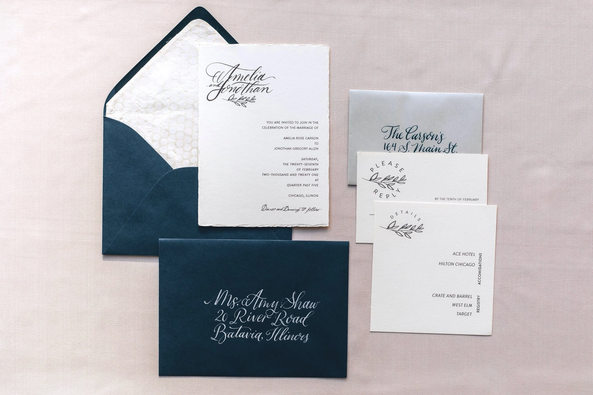
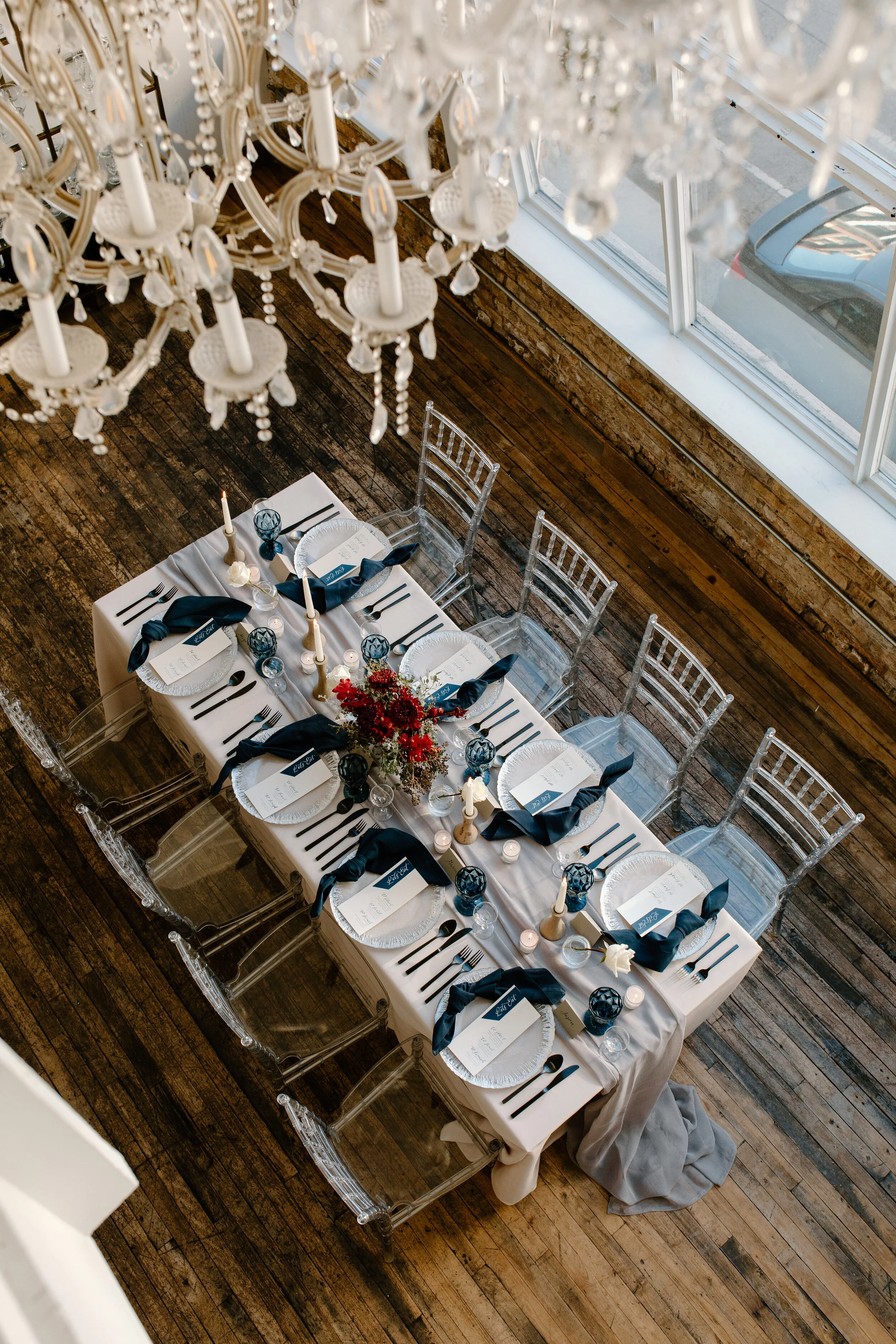
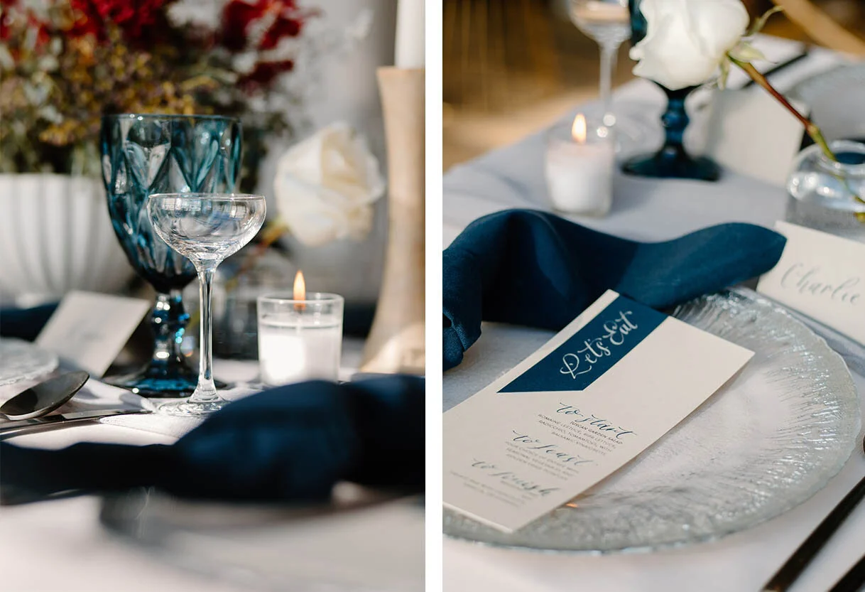
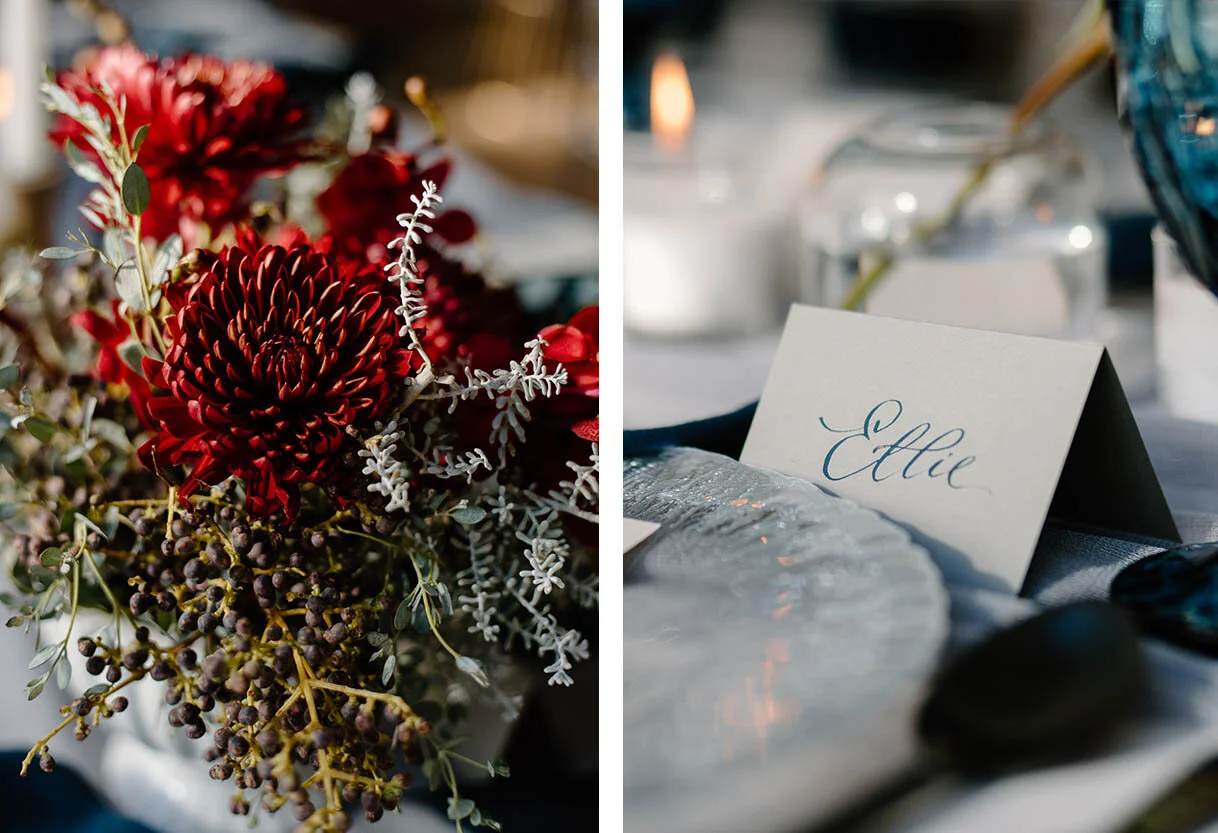
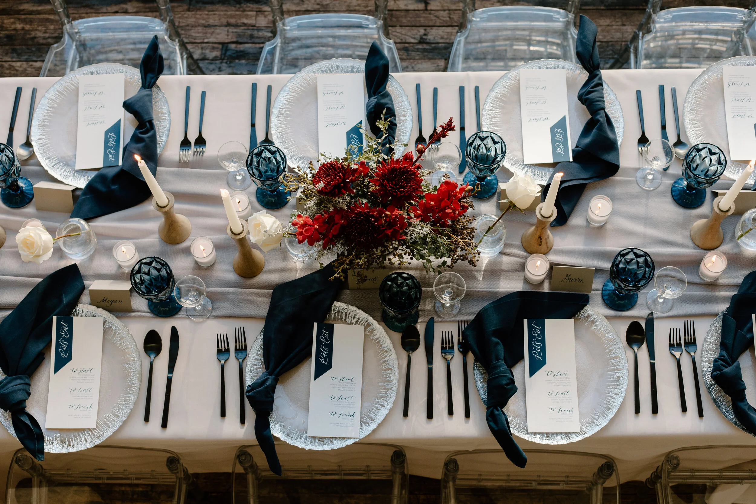
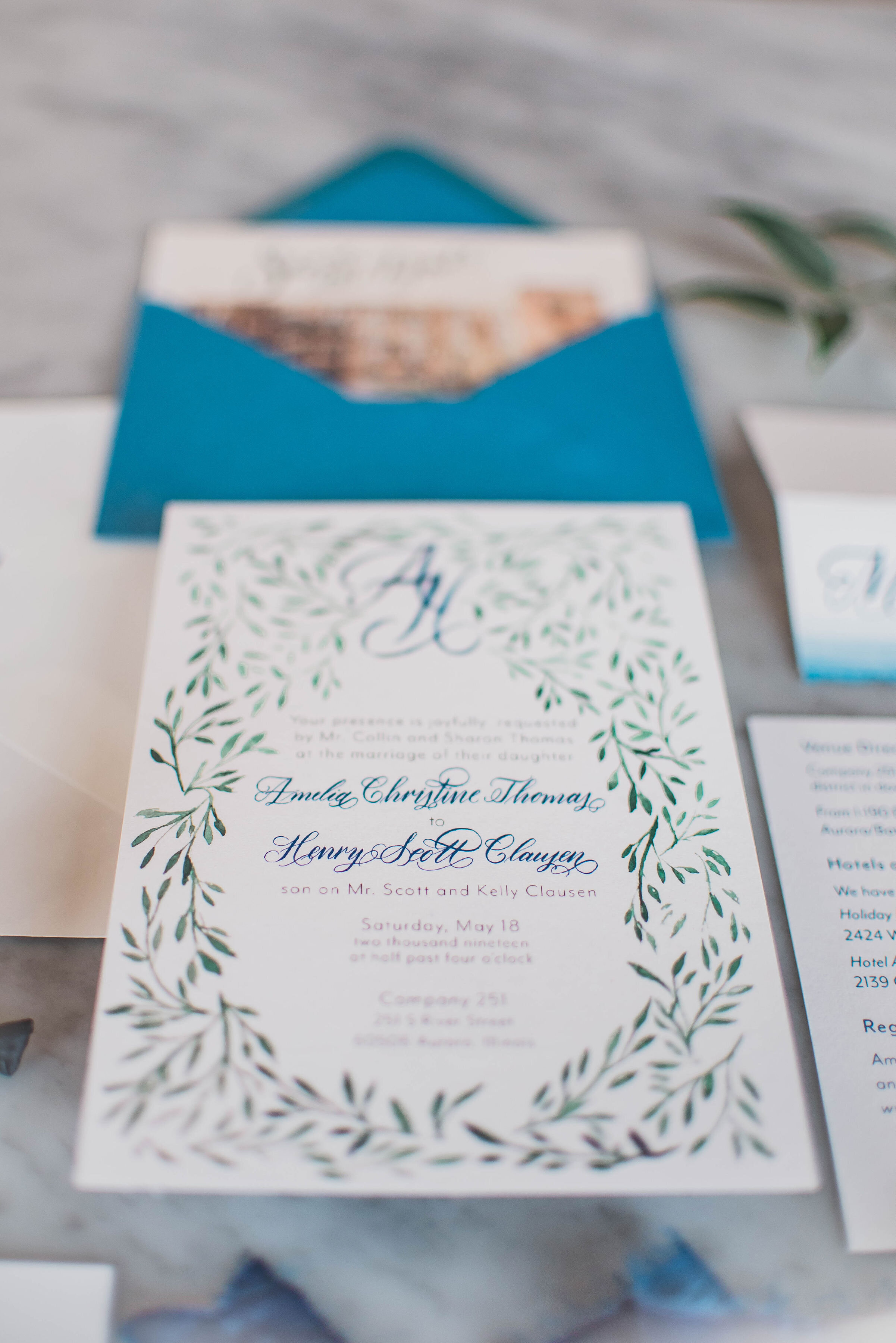
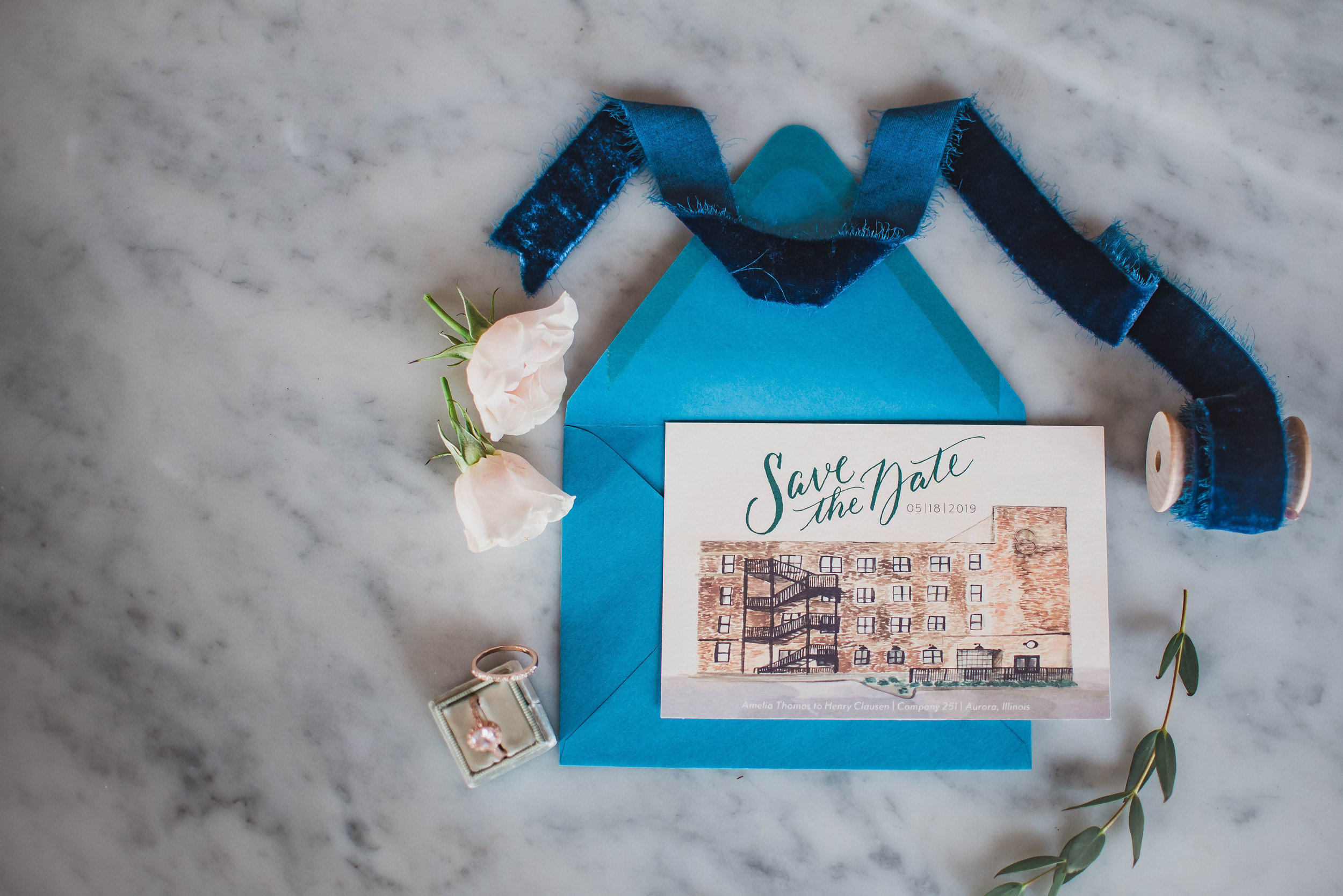
Since the invitation is the “main event” and involves a few more pieces and more information than the Save the Date, we advise you to start the design process early on. If you choose from the collection with minimal changes, it can be anywhere from 4- 6 week period. If you choose to go custom, depending on the print style, at a minimum with a digitally-printed invitation, you are looking at around 6-8 weeks for design and production. If you are looking for anything additional (letterpress, foil, ribbon, wax seals, custom maps, liners, calligraphy, etc) it can potentially add more time to that process by a few weeks depending on guests count.

That’s at minimum 2 months of back and forth to help me create your invite, which in the grand scheme of things is so important to get all the right information on the right cards and out to the right people, am I right? It is also important to give your designer enough time to creatively work through your requests and give you the best options. Start inquiring about invitations at the 6-month mark. Especially for custom work, as a designer, I do not create items perfectly the first time around. By putting the work upfront in filling out your questionnaire, giving me complete information, color swatches, and a mood board is how you will help me create that custom, unique design that is just right for you and your fiancé(e) and be the perfect complement to your Big Day!

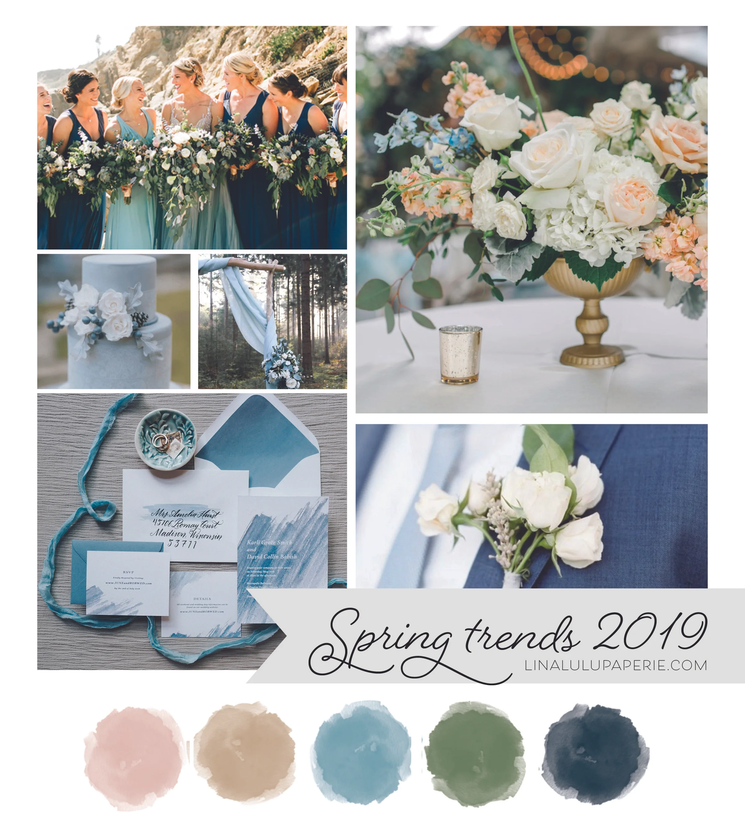
As noted above, the more info you have for your day the better. By having your date set, the venue booked, and having a rough idea or initial design meeting with your wedding planner on how the look and feel of your day will be a huge help when we start talking about your invitations. As soon as you have an idea of what you like, we can get started talking about design for your paper goods too!

I try to deliver the full suite at least a week prior to the “deadline” to ensure you can double-check your guest list and everything is in order. Check out my Wise Wedding: Invitation Details post for more information ( link will be posted here when ready).
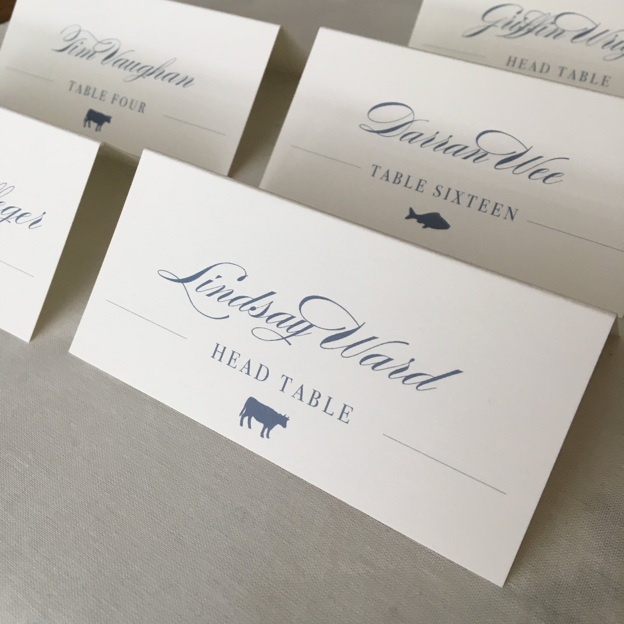
RSVP information

Reply cards or RSVP cards are sent out with the invite 2 months before the wedding date.

Your RSVP is included in your invitation suite and will be sent out to all your guests when your invite is. Typically an RSVP date is 1 month before the wedding. This gives you ample time to make sure each guest has replied back to confirm with the caterer, start seating arrangements, or for you to track down replies in case an invite was lost in the mail or from an inconsiderate guest. Each venue is different and may require a guest count sooner or later than the traditional 1-month mark. Make sure to double-check this info with your planner and/or venue.

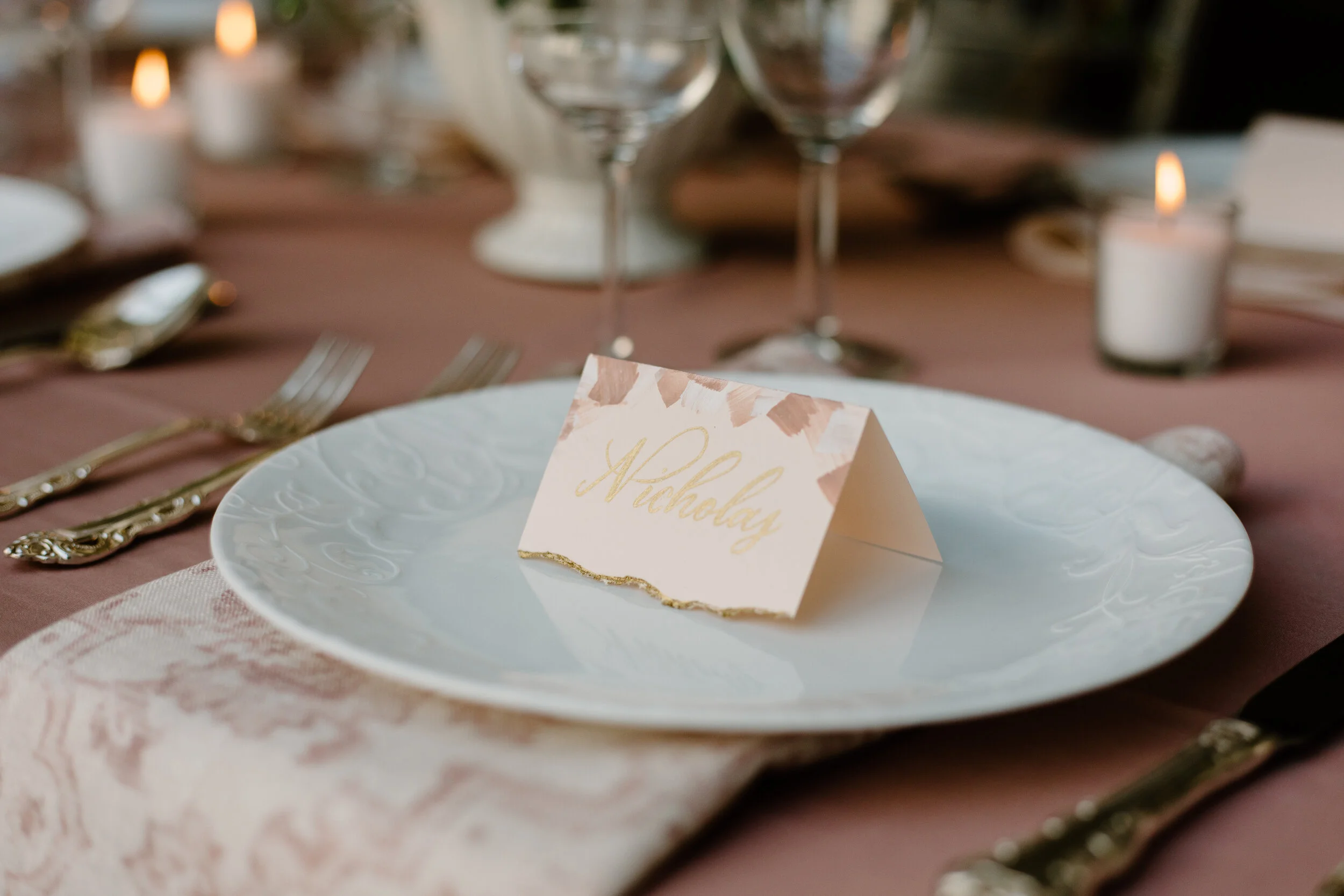
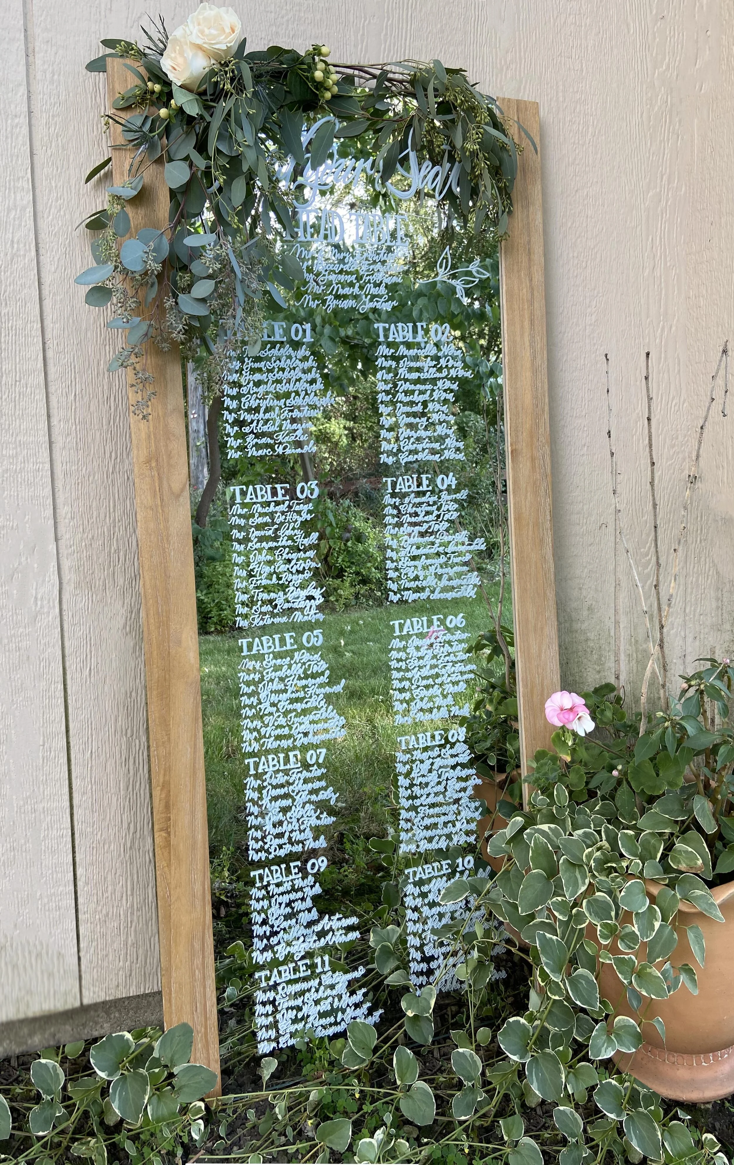
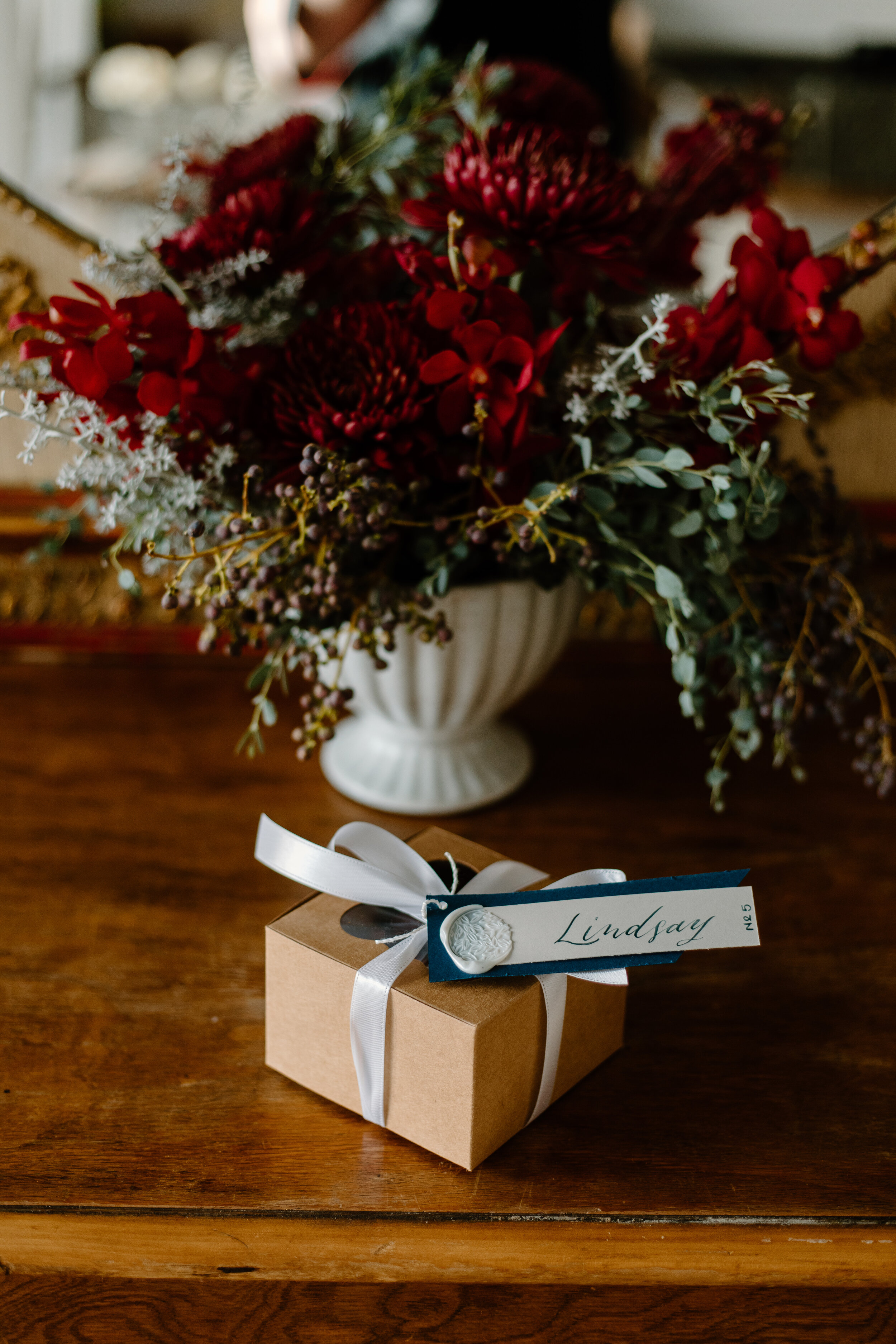
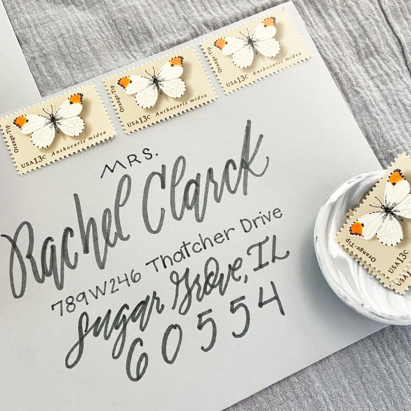
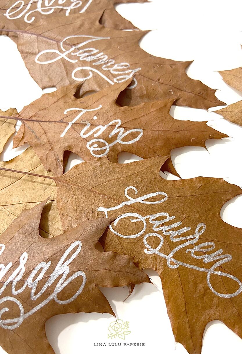
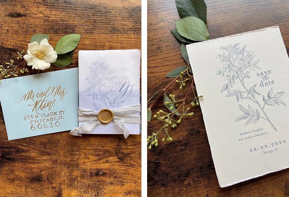
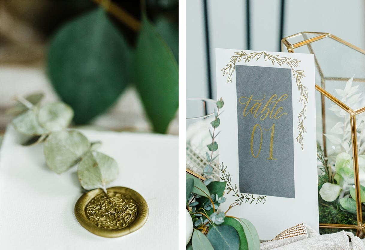
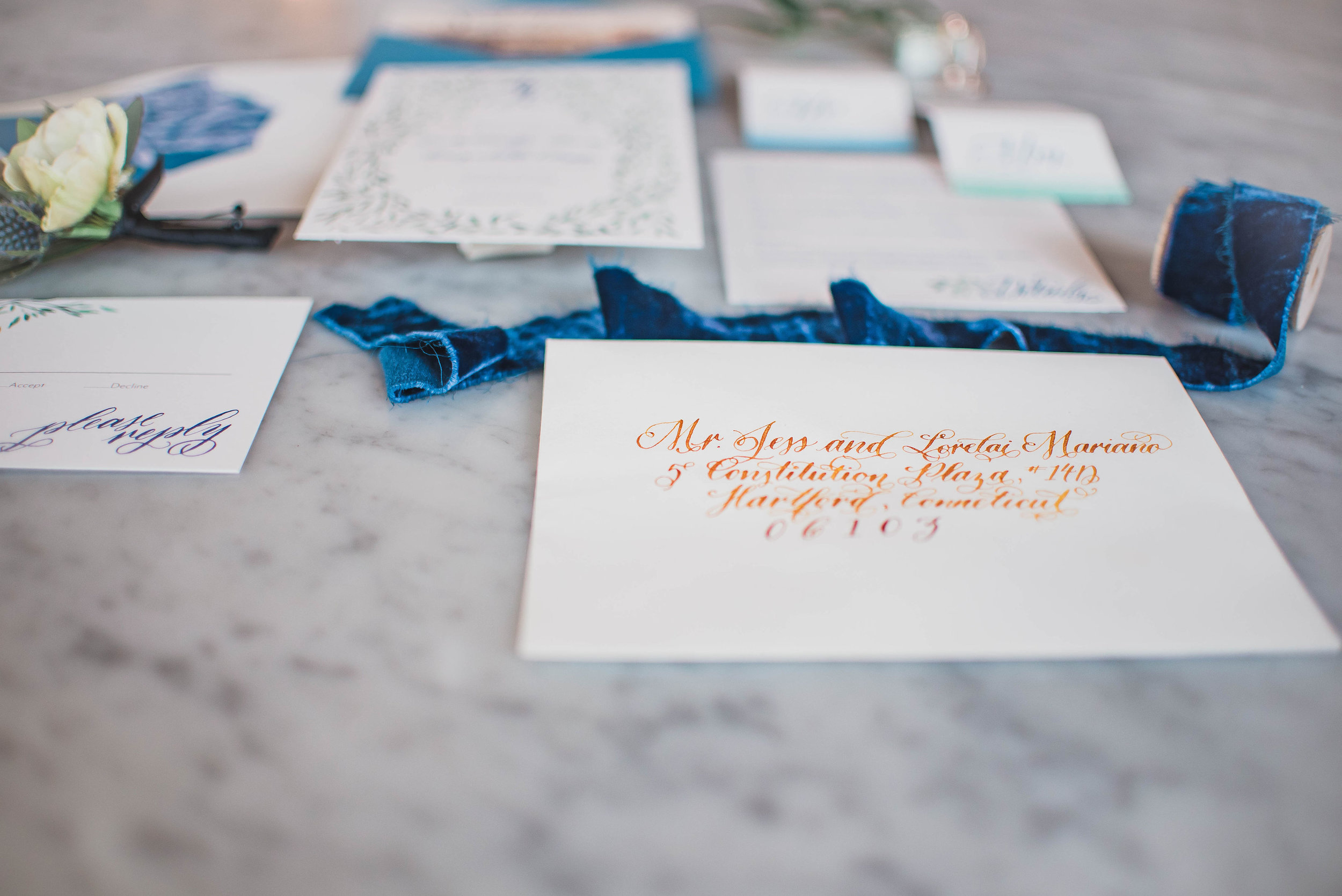
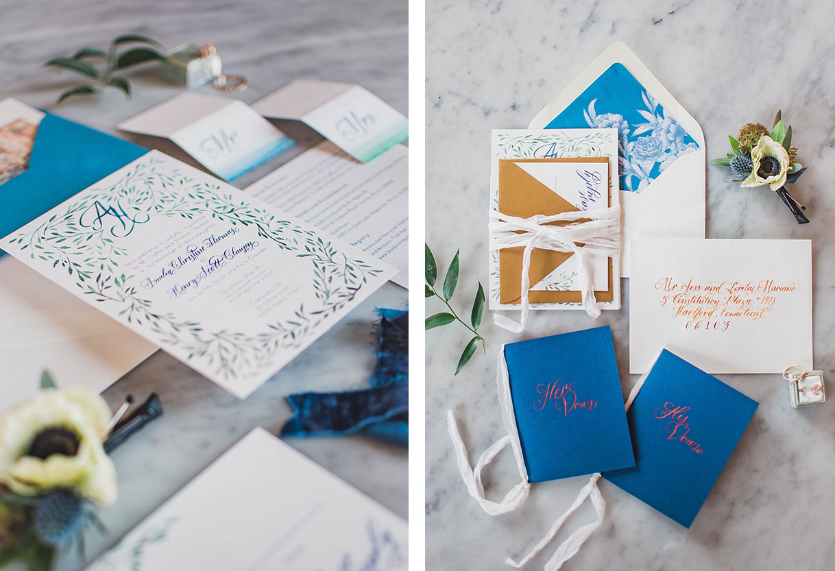
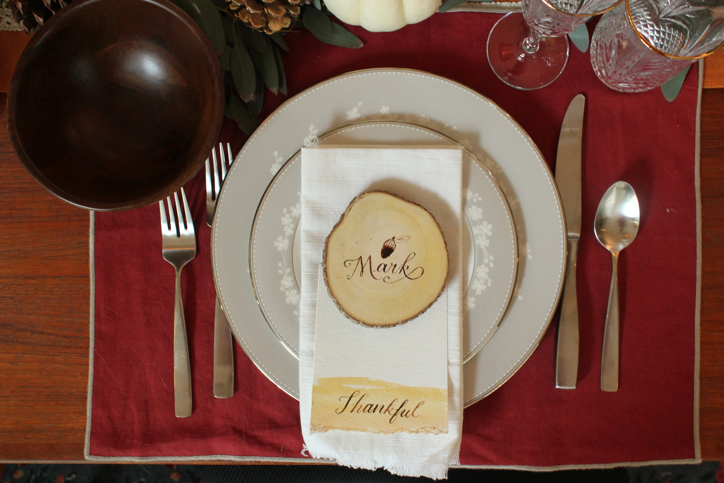
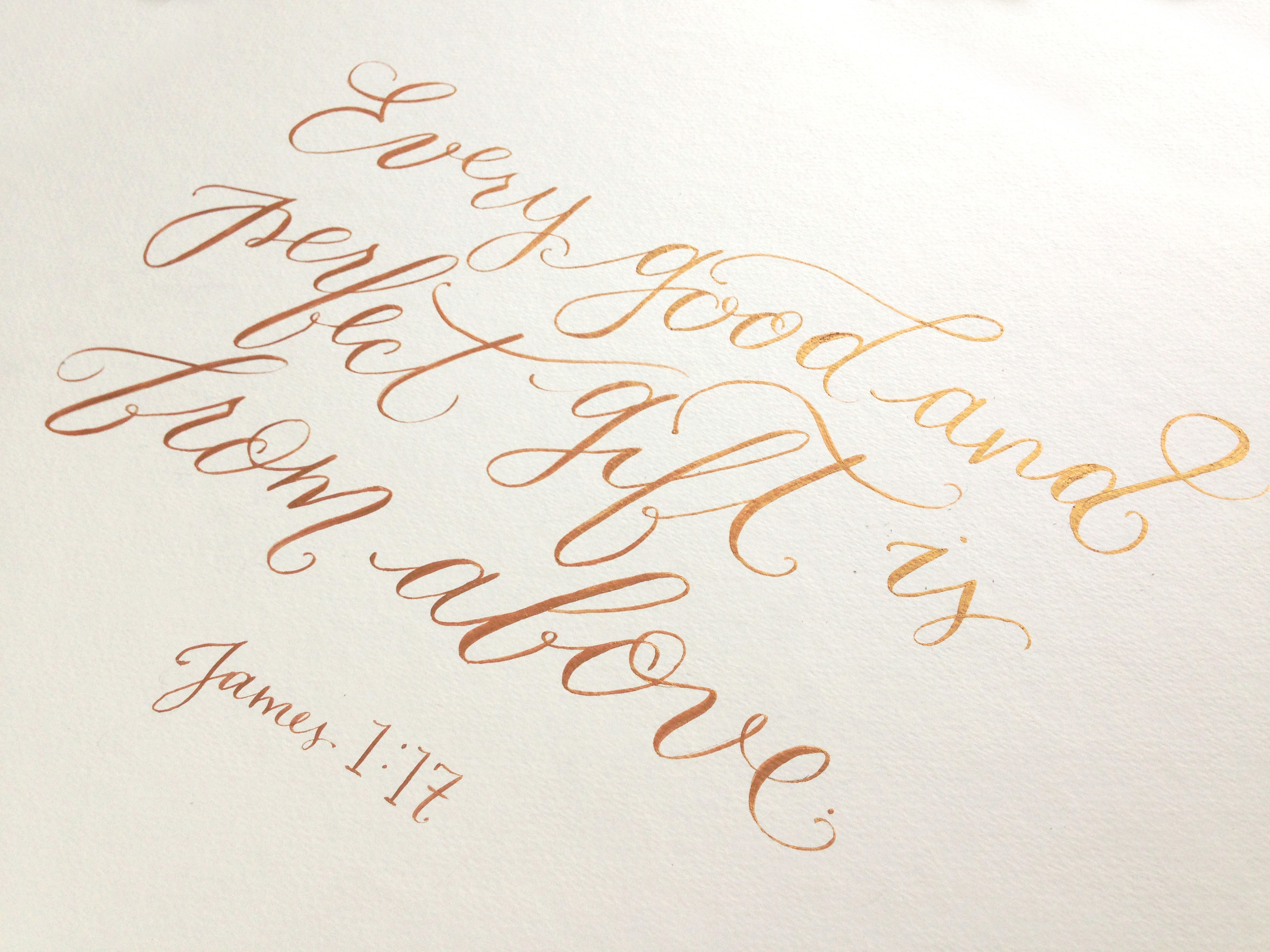
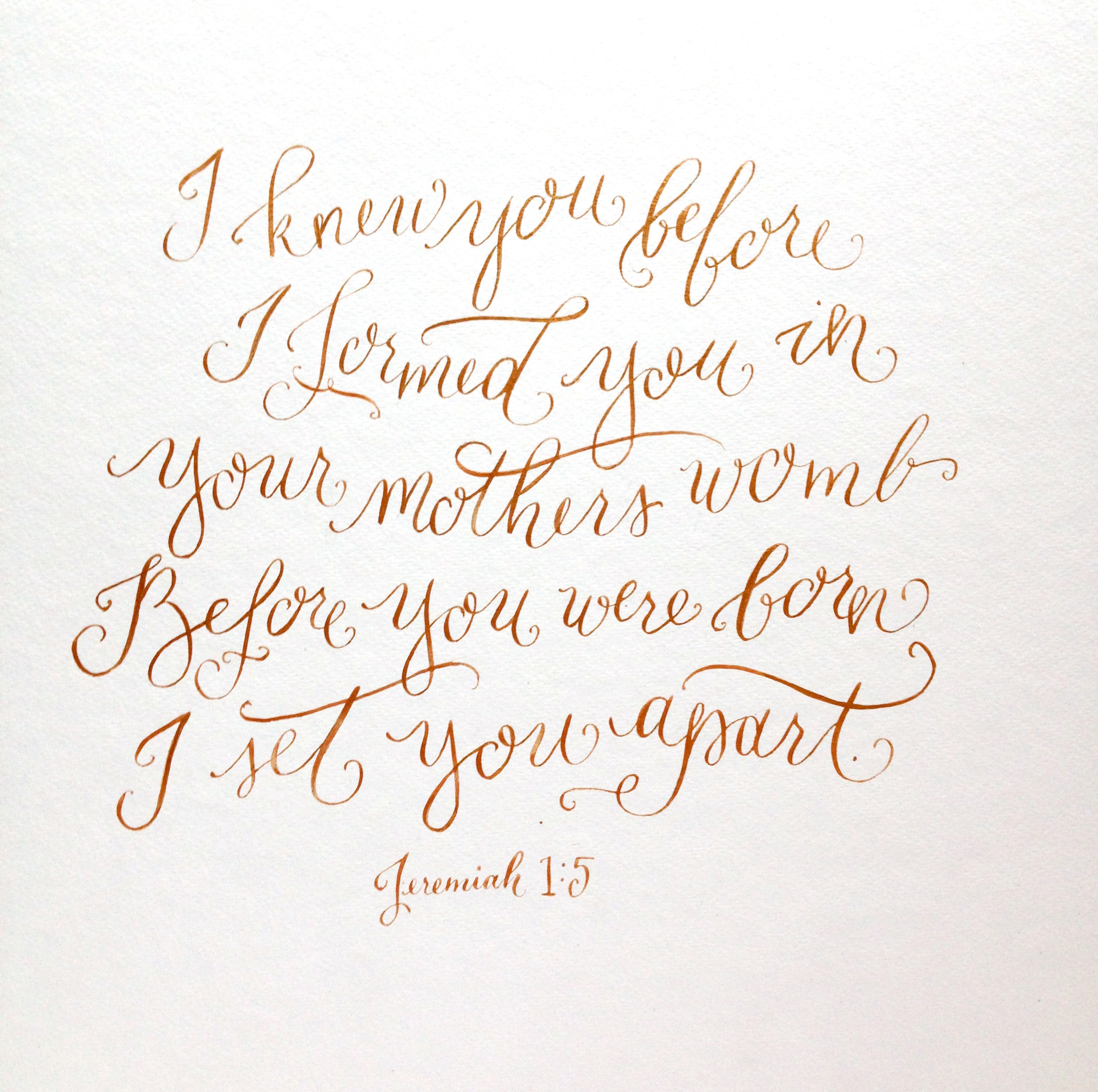
Calligraphy for Envelopes

Inquire at the time of your invitations if you are using the same person for design and calligraphy. If you are hiring a separate calligrapher than the invitation designer, inquire 1 month byt the latest before the invitations are to be sent out.

Fall2020_TeresaWilliams_StyledShoot_09.jpg

There are two options when addressing your envelopes, printed envelopes or hand-done calligraphy. Both can be beautiful options, but I am in full support of calligraphy for your mailing envelopes. When will you have another time in your life to really make a statement with your piece of mail? I may be biased, but I truly do believe that your invite feels complete with calligraphy addressing. I personally ask for at least two weeks for 50-100 names or three weeks for 150-250 names from when I receive the envelopes.

Yes, calligraphy can be done “last minute” but doesn’t need to be. Once I (or your designer) have decided on an envelope/paper color and it is ordered, the calligraphy can begin when the envelopes are received. Since you collected all your addresses with your Save the Dates way back around the 9-month mark before the wedding, you have all the information you need to send to your calligrapher. A quick tip is to keep your addresses in a spreadsheet with each guest’s title and full name included ( example. Dr. and Mrs. Jason and Sandra Smith, instead of Jay and Sandy Smith). Most designers and calligraphers, including myself, will ask you for a document like this. Bonus, this spreadsheet can help you track who has RSVPed, help with seating arrangements and keep track of wedding gift thank yous— win!

Designing Day of Items

You should start thinking about day-of items at least 3 months before your wedding date, and start finalizing everything in the 2-month and 1-month mark.

LinaLuluPaperie_EscortCard_Placecards.jpg

First, let me explain what a “day of item” is. It is anything that you will be needing just for the day of your wedding that adds to your decor and provides information to your guests. This can include programs, venues, place cards, escort cards, seating charts, welcome signs, etc. You should begin thinking about these around the same time you research your invitation look and feel. These items then can be booked around the 2-month mark. When you start your invitations, note to your designer the pieces you would like and which items you would like to coordinate with your invites look and feel and your receptions look at feel. This will allow them enough time to supply you with a design to approve, as well as order the right amount of product for you to receive finished, on time.

The last months of planning a wedding are of course full of finalizing details and making sure everything gets to the venue and set up the way you envisioned. This is no different for your day-of items. Learn more about the specifics of all the day-of items on the Wise Wedding: All the extra details post ( link will be posted here when ready).


Thank You Cards

Send a thank you from any bridal events 2-3 weeks from the event or from receiving the gift. From your wedding, thank you’s should be sent out no later than 3 months.

There is a myth going around that you have 1 year to send your thank you notes out from your wedding. This may be a newer myth due to couples opting to send a thank you card with a photo from their wedding on it, as wedding photos take longer to be edited and delivered to the couple. I recommend ordering a small amount of thank you cards that match your Save the Dates. This way you have themed cards on hand for thank yous for your shower and other bridal events or to write a special note to your bridal party. The nice thing about purchasing custom cards is that they don’t have to have the words “Thank you” printed on them. These cards can be have a pattern that is used in your weddding papergoods or have a monogram of your future, marrried name. By not including the actual words “thank you”, you can order a larger amount of custom cards that can be used for any event, including your wedding thank you notes.

If you have any other questions about the timeline for your paper goods or would like to talk about what I can help you with to check something off your current timeline, contact me here. In the meantime, to keep yourself organized, download my free wedding timeline checklist here.

Simple Additions to your Micro Wedding

The hardest part of planning a wedding in a pandemic is knowing when it is “safe” to celebrate again. With many loved ones now living states apart, gathering at a large wedding is not as simple as it once was.

I have loved seeing the innovation and solution of many couples turning to what is now deemed as a micro-wedding. These small gatherings include their families and inner circle of friends, typically on their intended wedding date, while planning on a gathering and celebrating with other social circles on a future date.

Though it might not be the large gathering you were originally planning, this event can still be beautiful with elegant and special touches that would not have been possible on a larger scale.

Personalized Favors:

Having a smaller gathering allows you to have a more intentional seating placement, as well as allows you to add a special flair with personalized favors! These favors can include engraved mini champaign bottles, holiday ornaments, bottle openers or something you feel like best represents your love story.

Adding the Extras

Fill in some of the gaps with extra beautiful signs at both your ceremony and reception. From a Welcome sign to personalized drink signs, splurge to include these beautiful (and often keep sake) items that can be used at your larger party in the future!

Photo by EV Photography Sign by Lina Lulu Paperie

Photo by EV Photography Sign by Lina Lulu Paperie

Keep Decor Simple, but Sentimental

With a smaller group attending will mean you have more time to mingle, dance, and add those special touches that will be meaningful to look back at when you look at your photos. Add those special touches through such things as the same flowers that your partner sent you the first month of dating, adding personalized menus at each place setting, swiping out table numbers for important milestones or places in your relationship, or have a cocktail named after your favorite song or your beloved pet you share (mine would be The Italics after my cat). These details, of course, can be added at any wedding of any size, but are great conversation starters as well as focal points for your guests in the smaller setting.

LinaLuluPaper_Menue

Styled Shoot: Dreamy, Bohemian Style in Chicago

LinaluluPaperie_Chicago_TeresaWilliams_StyledShoot.jpg

When I was asked to be apart of a shoot at Artifact Event Space I couldn’t say “yes” quicker! I have been to this space a few times, as well as helping with events, and it is just so dreamy! The exposed brick, gorgeous antiques, and light pouring in is the perfect setting for any Chicago party. All the touches from each vendor created the most magical blend of an elegant, city wedding with a touch of whimsy bohemian you could ask for!

LinaluluPaperie_Williams_ChicagoStyledShoot_01
LinaluluPaperie_Williams_ChicagoStyledShoot_04

Paper goods set the stage for your guests to understand what the “feel” of your wedding will be. With this Save the Date and invitation suite I choose hand-made paper with rough, deckled edges to contrast the timeless feel of the typography and hand-drawn botanicals.

By using two colors for the invitations, black and cornflower blue, the traditional elegance of a black-tie wedding is conveyed without sacrificing the laid-back vibes of the bohemian decor that the bride and groom have throughout their day.

Hand-done details, such as the vow books and the accent mirror, lend the bohemian elegance to this unconventional space in just the right touches without feeling out of place.

LinaluluPaperie_Chicago_TeresaWilliams_StyledShoot_03.jpg
LinaluluPaperie_Chicago_TeresaWilliams_StyledShoot_02.jpg

One of my favorite extra items for this wedding was this mirror! The unconventional shape next to the cake adds dimension and unexpected whimsy to the sweets table. I used the lyrics from Andrew McMahon in the Wilderness to add that extra touch of romance and sentimental flair (not that this beautiful couple needed it in the slightest - they’re so sweet together!).

Styled Shoot: Romantic, Gold and Green Brunch

I loved getting to be apart of this wedding brunch styled shoot with so many beautiful additions dreamt up by the Elisabeth Dari and her team! The gold, cream, and green accents are the perfect engagement or bridal brunch accents to warm up the colder, dreary months of winter. Check out the magic below.

LinaLuluPaperie_StyledShoot_DariEngagement_07.jpg
LinaLuluPaperie_Dari_StyledEnagementShoot.jpg

For the invitations, I went with a modern shop square accented with arch typographic details. The colors in the watercolor strokes and the touch of spot calligraphy added that bohemian feel.

Adding to the theme of mixed metals and greenery, I choose a gold envelope liner with gold calligraphy on the mailing envelope to off set the bronze and dark gun-metal gray on the invite.

LinaLuluPaperie_StyledShoot_DariEngagement_05.jpg
LinaLuluPaperie_StyledShoot_DariEngagement_04.jpg
LinaLuluPaperie_Dari_StyledShoot_Table.jpg

Adding these watercolor sayings to individual place settings, each with a different poem, lyric or phrase added that touch of intimacy to the table that a smaller gathering allows. Topping them off with eucalyptus and a gold wax seal added texture to this already beautiful tablescape.

LinaLuluPaperie_StyledShoot_DariEngagement_03.jpg
LinaLuluPaperie_Dari_StyledShoot_2020.jpg

Photos by Bozenavoytko Photography | Planner: Elisabeth Dari | Flowers: Stemming From Love

Styled Shoot: Company 251

When I was invited to a styled shoot by the talented Elisabeth Dari at Company 251 I couldn’t say “yes!” quick enough! This venue has been on my list since it opened. The natural elements of the building combined with gorgeous mixed metals, tiles and modern, minimalistic design aesthetic is the perfect canvas for all styles of weddings. Elisabeth drew inspiration from the history of the location, combined with an organic and romantic vibe—and wow—it is just too dreamy beyond words!

DSC_5066.jpg
DSC_5074.jpg

I created a custom invitation suite featuring lush, watercolor greenery flowing through out all the pieces and soft hints of the cobalt blue color that would be present in the cake, flowers and table decor. I love how my Rose calligraphy through out the suite create the romantic feel even before stepping into the gorgeous venue! I reflected the mixed metals elements of the space in the invites through an antique gold RSVP envelope and by using metallic ink on the mailing address.

StyledShoot_Compnay251_01.jpg

My favorite piece of the entire look had to be the custom watercolor Save the Date of the building itself! I loved creating this gorgeous and unique vintage postcard that could be used as a keepsake for the couple.

StyledShoot_Compnay251_02.jpg
DSC_5554.jpg
DSC_5714.jpg
StyledShoot_Compnay251_04.jpg
StyledShoot_Compnay251_03.jpg

Vendors, Artists, Producers

Venue | @company251

Design and Styling| @elisabethdari

Photography |@ev_photography

Cinematography | @kevinwagan

Floral |@stemmingfromlove @stevesflowermarket

Paper goods | @linalulupaperie

Catering | @flourishjuiceco

Bakery | @eyecandybakeshop

Bridal Boutique | @brizancouture

Artistry | @bsansostiartistry

All in the Details

Table Runner | @fabricwholesaledirect

Table Napkins, Flatware, Ring Box | #vintage Crystal Goblets, Mocktail Coupe | #vintage

Water Goblets | @lenoxusa #vintage Dinnerware | @westelm @westelmchicago

Modern Thanksgiving Table Inspiration

When thinking about Thanksgiving, it had me dreaming about the whole holiday season. I thought it would be fun to imagine a table that could transition from Thanksgiving day  to a more universal table for the winter season. 

LLP_BlueThanksgiving_Table02.jpg

To add dimension and a special touch, each napkin was wrapped in gold bakers twine with lavender and a watercolor leaf with the word "thankful".

LLP_BlueThanksgiving_Tablescape.jpg

I love the idea of mixing patterns and using the nontraditional fall color of blue to create a fun modern Thanksgiving table. This table and many of the elements could transition to a winter/Christmas table with some simple color and floral changes through out the season. (I'm thinking maybe wine colored tapers and adding glittery baubles among the pine cones).

LLP_BlueThanksgiving_Plates.jpg

To keep the warmth of Fall present and the table relevant to Thanksgiving, I included warm metallics like the gold chargers, flatware and the brass candle holders.

LLP_BlueThanksgiving_Sign.jpg

To include the theme throughout the room, I added a simple chalk-board sign to the sideboard pulling in the florals and pinecone. These signs are perfect to quickly change simple greetings, add a favorite holiday drink menu, or keep score for a family game after dinner!

Decoration:

Calligraphy: Lina Lulu Paperie | Dinner Plates  | Bowls | Salad Plates | Silverware | Table Runner from T.J. Maxs | Place Mats (Similar) | Brass Candle Holders (Family Heirloom ) Simular Item | Blue Glass Candle Holders (Family Heirloom ) Similar Item | Pine Cones | Napkins,Target Dollar Section | Chalk Sign, Target Dollar Section | Wooden Server

Traditional Thanksgiving Table Inspiration

When I think of a traditional Thanksgiving, I think of warm Fall colors (like brown, red and orange), leaves and happy turkeys. Those thoughts became the inspiration for this traditional Thanksgiving table, including almost all my favorite fall items.

LLP_ThanksTable_Name01.jpg

To add a special touch to each guests seat, I included a custom coaster doubling as a name card. Underneath the name card, I placed a peice of paper that each guest could jot down what they were thankful for as a keepsake and reminder for the year to come. 

LLP_ThanksTable_Sign.jpg
IMG_2382.JPG
IMG_2329.JPG

Filling the table with pumpkins gives a fun nod to the bounty of the first Thanksgiving pictures of the event often depicts. I chose silver plates and silverware to offset the warm tones reflected in the placemats, pumpkins, acorns and pinecones.

LLP_ThanksTable_Pumpkins.jpg

Styled Shoot: Being Joy Photography at Venue 5126

I met Joy this summer at a local wedding gathering and instantly loved her spirit and vibe. I then proceeded to fall in love with her style and gorgeous photos! She invited me to be a part of an amazing team assembled to create a gorgeous boho inspired shoot  at Venue 5126 in Oswego, Illinois. 

BeingJoy_Suite_Shoot_02.jpg
BeingJoy_Suite_Shoot.jpg
Being Joy Photography-60.jpg

Finding the right mix of modern, boho, and romantic was my aim as I created a simple but sophisticated wedding suite for this shoot. A combination of hand drawn botanicals, calligraphy and gold embossing become the perfect mix to produce a wild and tame feeling all in one.

Being Joy Photography-50.jpg

The Incredible Vendor team included: Photography, Being Joy Photography  | Venue and Props, Venue 5126. | Flowers, Ashland and AddisonRJPdesigns | Gowns, Victoria Sdoukos Couture. | Hair, Hair By Dorthi. | Make-Up, Alana G | Models, Gabija Guzauskaite and Whitman Johnson

Dream Patio

Summer is so close! With our move to a new apartment last Fall we gained a patio space. I must say this was one thing I felt was lacking in our old apartment. With the days getting warmer, I can't stop dreaming about what our patio will look like and spending time there! Here are a few dream patios of mine...

I have been loving the fun black and white trend with a pop of color. I'll be honest, I don't love the color pink. Look at that lounge chair though! I love the scallops and the way it would pops with so many black and white accents. Just imagine the space filled with leafy palms and how the soft light would look at twilight bouncing off the gold plant stands. Dreamy!

My second dream patio mixes fun patterns and the ease of the boho trend. Pulling in more bright colors, beautiful wicker lounge chairs, and teases of copper and gold—this space would be great for relaxing on any day of the week. I love the idea of hanging plants to give a "surrounded" feel to the patio, but creating more foot space. Wouldn't it also be fun to fill that pretty geometric lantern with fairy lights?

I'm still figuring out what would fit in our smaller patio space (as well as in our budget), but I'll keep looking around and combining my dream patios till I find my "can't part with "pieces. 

Color Companion : Spring Florals, Anthropologie

Flowers are great any time of the year and Springtime is their time to shine! I love the variety and stylization that floral prints take on. I couldn't narrow it down to  one type (because I love SO many!), I decide to narrow it down to one company. Anthropologie is dreamy unto itself, but then you add all the floral's and BOOM - a slice of paradise. I especially am excited for the Paper Crown & Rifle Paper Company collaboration line ( lower bottom left).

I love the variety of florals they always have in store. From their clothes to their home goods, everything looks good with a little floral splash - am I right?  How do you use florals?  Are they everywhere or do you limit them to just clothes?

Clockwise: Chair | Wallpaper | Bedspread | Dress

Giveaway Time!

Everyday_plant_sun.jpg

It feels like I have piles of work to share you all! With the rush of the holiday season, it seems this little space has been put on the back burner. With 2015 coming swiftly, I know one of my resolutions will be to put more time into updating my work.

On that same note, my dear friend from high school, Meredith Bazzoli, has written up a lovely piece on the coming of the new year and resolutions for 2015 over on her blog , Very Revealing. To accompany her fantastic post, I have worked with her on the print you see above as a fun giveaway to spark you on the road to keeping your resolutions for the new year!

Meredith writes in a matter of fact, down to earth style infused with humor that will make you feel like you have been friends for years. To enter the giveaway, jump over to Very Revealing and subscribe to her new series, Revealing Resolutions.

The new year is already being to look up!